Grid
Grid is an alternative to Box whenever we want to use CSS Grid Layout instead.
Props
| Property | Value | Description |
|---|---|---|
| as | (React Component) | The component it renders to. (default: div) |
| extend | (Style Object) | Extends the Fela style object |
| style | (Style Object) | Inline styles |
| className | (string) | Custom CSS classes |
| gap | (length) | CSS grid-gap property |
| columns | grid-template-columns | CSS grid-template-columns property |
| rows | grid-template-rows | CSS grid-template-rows property |
Defaults
{
  display: grid;
  box-sizing: border-box;
  grid-gap: 0
}
BaselineGrid
The gap prop acts as multiples of an optional baselineGrid that can be passed with a theme.
It defaults to 1 and thus works without a theme as well.
Example
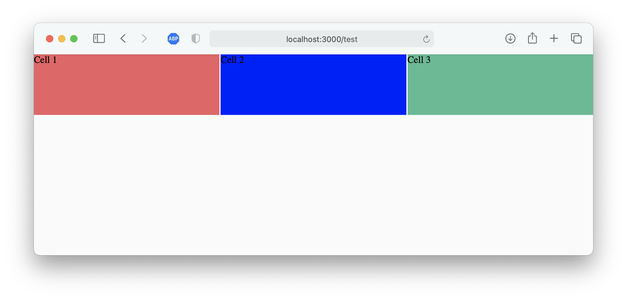
import { Grid, Box } from 'kilvin'

const Centered = () => (
  <Grid gap={2} columns={['1fr', 'repeat(2, 1fr)', 'repeat(3, 1fr)']}>
    <Box height={100} extend={{ backgroundColor: 'red' }}>
      Cell 1
    </Box>
    <Box height={100} extend={{ backgroundColor: 'blue' }}>
      Cell 2
    </Box>
    <Box height={100} extend={{ backgroundColor: 'green' }}>
      Cell 3
    </Box>
  </Grid>
)