Box
Box is probably the most important component.
It is used to craft detailed layouts based on flexbox.
It also defines box-model properties such as padding, margin and border.
It ships with sensible flexbox defaults:
{
  box-sizing: border-box;
  display: flex;
  flex-grow: 0;
  flex-shrink: 0;
  flex-basis: auto;
  flex-direction: column;
  flex-wrap: nowrap;
  align-items: stretch
}
Props
| Property | Value | Description |
|---|---|---|
| space | (number) | Adds space in between child components |
| spaceType | spacer, container |
Whether the space element is added in-between child components or wraps them (default: spacer) |
| containerElement | (React Component) | The component used to wrap children if container is passed to spaceType (default: div) |
| as | (React Component) | The component it renders to (default: div) |
| extend | (Style Object) | Extends the Fela style object |
| style | (Style Object) | Inline styles |
| className | (string) | Custom CSS classes |
| display | (number) | CSS display property |
| width | (length) | CSS width property |
| minWidth | (length) | CSS minWidth property |
| maxWidth | (length) | CSS maxWidth property |
| height | (length) | CSS height property |
| minHeight | (length) | CSS minHeight property |
| maxHeight | (length) | CSS maxHeight property |
| padding | (length) | CSS padding property |
| paddingTop | (length) | CSS paddingTop property |
| paddingRight | (length) | CSS paddingRight property |
| paddingBottom | (length) | CSS paddingBottom property |
| paddingLeft | (length) | CSS paddingLeft property |
| margin | (length) | CSS margin property |
| marginTop | (length) | CSS marginTop property |
| marginRight | (length) | CSS marginRight property |
| marginBottom | (length) | CSS marginBottom property |
| marginLeft | (length) | CSS marginLeft property |
| grow | (number) | CSS flex-grow property |
| shrink | (number) | CSS flex-shrink property |
| basis | (length) | CSS flex-basis property |
| flex | (flex-grow) (flex-shrink) (flex-basis) | CSS flex property |
| justifyContent | flex-start, flex-end, center, space-between, space-around |
CSS justify-content property |
| alignContent | flex-start, flex-end, center, space-between, space-around |
CSS align-content property |
| alignItems | flex-start, flex-end, center, baseline, stretch |
CSS align-items property |
| alignSelf | flex-start, flex-end, center, baseline, stretch |
CSS align-self property |
| order | (number) | CSS order property |
Defaults
{
  display: flex;
  box-sizing: border-box;
  flex-grow: 0;
  flex-shrink: 0;
  flex-basis: auto;
  flex-direction: column;
  flex-wrap: nowrap;
  align-items: stretch
}
BaselineGrid
Some props act as multiples of an optional baselineGrid that can be passed with a theme.
It defaults to 1 and thus works without a theme as well.
Those are all padding and margin values.
Example
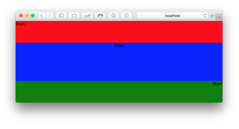
import { Box } from 'kilvin'

const Centered = () => (
  <Box grow={1} justifyContent="center">
    <Box grow={1} alignItems="flex-start" extend={{ backgroundColor: 'red' }}>
      Start
    </Box>
    <Box grow={2} alignItems="center" extend={{ backgroundColor: 'blue' }}>
      Start
    </Box>
    <Box grow={1} alignItems="flex-end" extend={{ backgroundColor: 'green' }}>
      Start
    </Box>
  </Box>
)